Getting Started with Infographic Assignments

07.24_getting-started-with-infographics

Infographics have become a nearly ubiquitous accompaniment to written reports and presentations. For today’s students, visual communication skills are as important as written and verbal ones. Plus, adding an infographic to a text assignment gets students to think about the central message they are trying to convey to the reader, which can help teach them about communicating with focus—something they often struggle with.

Unfortunately, most students don’t learn infographic design, because few instructors outside of graphic design feel competent to teach this skill. But free online apps such as Canva, Visme, and Adobe Express provide users with hundreds of templates that make it easy to create infographics without any specialized graphic design skills. This means that instructors do not need to teach graphic design skills but rather how to conceptualize the central theme of a work with an image that enhances it for the reader.

Infographic creation simply amounts to understanding a few basic principles, which instructors can easily teach in a short tutorial. I recommend showing students examples of good and bad infographics and asking them what they think of the images. Their responses will lead to the principles themselves, making the lesson closer to a Socratic dialogue than a lecture. Students can then apply what they learn by being required to include an infographic with their next assignment that summarizes the main message. This is an excellent assignment for peer review as students can exercise their creativity by suggesting different ways to represent a central theme. In this way the entire class will learn together.

Fundamental principle: Amplify the message, don’t just repeat it

The most important principle behind infographics is that they are not merely decorative but add something to the text message to make it more effective. Common visualizations, such as word clouds and Venn Diagrams are often used to merely project certain words from the text, without doing anything to help the reader understand the message. The real trick in making an infographic is to think about how imagery can enhance the message in a text.  For instance, one of the most famous infographics was made by Charles Joseph Minard in 1869 to illustrate Napoleon’s disastrous invasion of Russia in 1812.
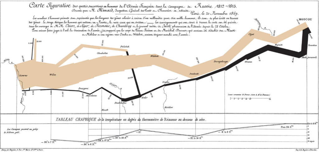
French-language infographic by Charles Minard, characterized by zig-zagging black and tan lines of varying thickness.

The thickness of the lines represents the number of soldiers in Napoleon’s army, with the brown lines representing the journey to Moscow and the black lines the return. The beauty of the graphic is that the viewer is immediately struck by how the losses were not incurred in large battles, as one might expect, but rather a steady deterioration in numbers over time due to the hardships of the journey itself. The branching lines also demonstrate how some solders just plain abandoned the expedition. The image conveys the slow-motion trainwreck nature of the campaign in clear and powerful terms that summarize and amplify the message of the text. The creator achieved this by representing numbers of soldiers by the thickness of lines on a map of the journey. This translation of numbers into imagery is the creativity of the graphic and exemplifies how to communicate a concept visually to improve both rational understanding and emotional response.

Poorly designed infographics, by contrast, often attempt to cram too much information into an image, essentially trying to reproduce the article in a smaller font. They might include a dizzying array of colors and topics that undermine any attempt at conveying an overarching message. Seo.com and Visme have good articles with examples of bad infographics that instructors can either use in their tutorials or direct students to.

Further principles

Randy Krum’s book Cool Infographics contains some additional stylistic principles that help improve infographics:

  1. Tell one story. An infographic should summarize the main point that the author wishes to convey, not a bunch of points. It can have a number of pieces of information (not too many), but all that information should be tethered to a main point that the reader should easily grasp.
  2. Minimize text. While an infographic can use text, if it contains blocks of text against a pretty background, it is just dressing up the text of the talk or report, not communicating anything beyond what was covered elsewhere.
  3. Simplify, simplify, simplify. The graphic should not be so complex that the reader needs to study it like a flowchart to make sense of it. There should be one design element, with the visual communicating as much as possible.
  4. Chart types. While an ordinary pie or bar chart is a type of infographic, it is not an especially creative type. Students without other ideas might default to a chart and then think about how to make it more meaningful to the reader. If so, they must be careful to use the correct type and in the correct way, with this article by Nayomi Chibana providing some helpful hints.

Infographic design not only teaches students a valuable communication skill but also helps them analyze their work in terms of its central message, making it beneficial for students in nearly any field.

Leave a Reply

This site uses Akismet to reduce spam. Learn how your comment data is processed.

Related Articles

Love ’em or hate ’em, student evaluations of teaching (SETs) are here to stay. Parts <a href="https://www.teachingprofessor.com/free-article/its-time-to-discuss-student-evaluations-bias-with-our-students-seriously/" target="_blank"...

Since January, I have led multiple faculty development sessions on generative AI for faculty at my university. Attitudes...
Does your class end with a bang or a whimper? Many of us spend a lot of time...

Faculty have recently been bombarded with a dizzying array of apps, platforms, and other widgets...

The rapid rise of livestream content development and consumption has been nothing short of remarkable. According to Ceci...

Feedback on performance has proven to be one of the most important influences on learning, but students consistently...

wpChatIcon

Infographics have become a nearly ubiquitous accompaniment to written reports and presentations. For today’s students, visual communication skills are as important as written and verbal ones. Plus, adding an infographic to a text assignment gets students to think about the central message they are trying to convey to the reader, which can help teach them about communicating with focus—something they often struggle with.

Unfortunately, most students don’t learn infographic design, because few instructors outside of graphic design feel competent to teach this skill. But free online apps such as Canva, Visme, and Adobe Express provide users with hundreds of templates that make it easy to create infographics without any specialized graphic design skills. This means that instructors do not need to teach graphic design skills but rather how to conceptualize the central theme of a work with an image that enhances it for the reader.

Infographic creation simply amounts to understanding a few basic principles, which instructors can easily teach in a short tutorial. I recommend showing students examples of good and bad infographics and asking them what they think of the images. Their responses will lead to the principles themselves, making the lesson closer to a Socratic dialogue than a lecture. Students can then apply what they learn by being required to include an infographic with their next assignment that summarizes the main message. This is an excellent assignment for peer review as students can exercise their creativity by suggesting different ways to represent a central theme. In this way the entire class will learn together.

Fundamental principle: Amplify the message, don’t just repeat it

The most important principle behind infographics is that they are not merely decorative but add something to the text message to make it more effective. Common visualizations, such as word clouds and Venn Diagrams are often used to merely project certain words from the text, without doing anything to help the reader understand the message. The real trick in making an infographic is to think about how imagery can enhance the message in a text.  For instance, one of the most famous infographics was made by Charles Joseph Minard in 1869 to illustrate Napoleon’s disastrous invasion of Russia in 1812.

French-language infographic by Charles Minard, characterized by zig-zagging black and tan lines of varying thickness.

The thickness of the lines represents the number of soldiers in Napoleon’s army, with the brown lines representing the journey to Moscow and the black lines the return. The beauty of the graphic is that the viewer is immediately struck by how the losses were not incurred in large battles, as one might expect, but rather a steady deterioration in numbers over time due to the hardships of the journey itself. The branching lines also demonstrate how some solders just plain abandoned the expedition. The image conveys the slow-motion trainwreck nature of the campaign in clear and powerful terms that summarize and amplify the message of the text. The creator achieved this by representing numbers of soldiers by the thickness of lines on a map of the journey. This translation of numbers into imagery is the creativity of the graphic and exemplifies how to communicate a concept visually to improve both rational understanding and emotional response.

Poorly designed infographics, by contrast, often attempt to cram too much information into an image, essentially trying to reproduce the article in a smaller font. They might include a dizzying array of colors and topics that undermine any attempt at conveying an overarching message. Seo.com and Visme have good articles with examples of bad infographics that instructors can either use in their tutorials or direct students to.

Further principles

Randy Krum’s book Cool Infographics contains some additional stylistic principles that help improve infographics:

  1. Tell one story. An infographic should summarize the main point that the author wishes to convey, not a bunch of points. It can have a number of pieces of information (not too many), but all that information should be tethered to a main point that the reader should easily grasp.
  2. Minimize text. While an infographic can use text, if it contains blocks of text against a pretty background, it is just dressing up the text of the talk or report, not communicating anything beyond what was covered elsewhere.
  3. Simplify, simplify, simplify. The graphic should not be so complex that the reader needs to study it like a flowchart to make sense of it. There should be one design element, with the visual communicating as much as possible.
  4. Chart types. While an ordinary pie or bar chart is a type of infographic, it is not an especially creative type. Students without other ideas might default to a chart and then think about how to make it more meaningful to the reader. If so, they must be careful to use the correct type and in the correct way, with this article by Nayomi Chibana providing some helpful hints.

Infographic design not only teaches students a valuable communication skill but also helps them analyze their work in terms of its central message, making it beneficial for students in nearly any field.