The Value of Infographic Assignments

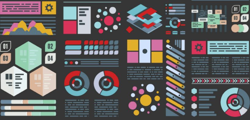
In most disciplines, students learn how to communicate using a mix of text, tables, and figures—how their instructors were taught to communicate. But today, complex infographics are among the most powerful means of communicating the significance of information. They take brute data, distill it down to its significance, and convey that significance through visuals that capture the reader’s imagination. Our eyes tend to gravitate to the infographics in articles first, and thus infographic assignments train students to not only look for the significance in information but also communicate that significance in a persuasive way. This is a skill that can serve students in their professional lives as well as in their roles as citizens.

To continue reading, you must be a Teaching Professor Subscriber. Please log in or sign up for full access.

Leave a Reply

This site uses Akismet to reduce spam. Learn how your comment data is processed.

Related Articles

Love ’em or hate ’em, student evaluations of teaching (SETs) are here to stay. Parts <a href="https://www.teachingprofessor.com/free-article/its-time-to-discuss-student-evaluations-bias-with-our-students-seriously/" target="_blank"...

Since January, I have led multiple faculty development sessions on generative AI for faculty at my university. Attitudes...
Does your class end with a bang or a whimper? Many of us spend a lot of time...

Faculty have recently been bombarded with a dizzying array of apps, platforms, and other widgets...

The rapid rise of livestream content development and consumption has been nothing short of remarkable. According to Ceci...

Feedback on performance has proven to be one of the most important influences on learning, but students consistently...

wpChatIcon

In most disciplines, students learn how to communicate using a mix of text, tables, and figures—how their instructors were taught to communicate. But today, complex infographics are among the most powerful means of communicating the significance of information. They take brute data, distill it down to its significance, and convey that significance through visuals that capture the reader’s imagination. Our eyes tend to gravitate to the infographics in articles first, and thus infographic assignments train students to not only look for the significance in information but also communicate that significance in a persuasive way. This is a skill that can serve students in their professional lives as well as in their roles as citizens.

Infographic assignments might seem technically complex, but free and easy-to-use software allows anyone to create an infographic without needing any graphic design skills. The real lift is teaching students to think about how to visualize information.

Teaching how to make an infographic

An instructor wishing to incorporate infographic assignments into their courses should start by providing students with examples of different ways of visually representing information. Monica Burns (2019) recommends the Infographics for Kids Pinterest page for a number of good examples. Cool Infographics, a website created by Randy Krum, has many effective examples and tips on creating infographics. I recommend picking a couple of examples to illustrate how the designer drew out a message from data and conveyed it in an easy-to-understand manner.

Next, instructors should ask students come up with some infographic ideas for different types of information. Offer some examples of types of information, such as rising carbon dioxide levels, and ask students how the examples could be represented as an infographic.

Finally, instructors should explain the process of creating an infographic. Jonathan Schwabish’s PolicyVis website has an excellent discussion of the basic principles for creating infographics; it is well worth sending students there for guidance. These include concepts such as reducing clutter and thinking about how the brain will process the overall visual before any details. The principles also apply beyond infographics to presentations in general.

You can walk students through the process with an example. For instance, Nadieh Bremer, a data visualization designer, wanted to represent the striking increase in the number of deportations from Europe over the past few years. The raw data was the number of deportations from Europe, and the theme was that they were increasing significantly. Bremer started with a map of the world and on each European country put circles whose sizes corresponded to the number of deportations from that country. She then used information from Frontex, the agency the European Union uses to run deportation flights, to identify where people were being deported to. Lines emanating from each circle indicated the destinations of the flights. Finally, Bremer added animation to mimic the tracking of a flight by radar.

In this way the information comes alive for the viewer. Instead of seeing brute data as numbers, the viewer sees it in terms of movement from Europe to somewhere else. This conveys the significance of the information in terms of people’s displacement.

The graphic then serves as a useful discussion prompt. The viewer is likely to ask why some countries are deporting more people than others and why the destinations where chosen. Of course, the deportations are probably the reverse of immigrations, and so the graphic leads to both the questions of why people are coming to Europe from various locations and why Europe is sending them back. The information could have been represented in charts and spreadsheets, but an infographic can grab the viewer’s attention and generate questions in their mind that brute data alone does not.

Infographic assignments are also ideal for student sharing and peer review. Students can post the infographic within their institution’s LMS or elsewhere and have other students comment on it. Students enjoy talking about what visuals work and do not work and how they might be improved to amplify the message. In this way students learn from one another.

Software for creating the infographic

There are a variety of free websites for creating infographics. Importantly, students do not need to start from scratch. Each website has a multitude of templates to choose from as a starting point for the design. The templates are organized by purpose (e.g., Facebook or Instagram postings) and content (e.g., timeline or concept map). The user picks a template and uses drag and drop to swap out the elements in it for their own. The result is a professional-looking design without any design work.

Adobe Spark is an excellent system that was recently profiled in the Teaching Professor. Spark allows the user to create graphics, videos, and websites in a single system, making it ideal for a variety of different projects. Since the functionality is similar for creating each type of media, students can simply create an infographic or go on to use it in a video or on a website. Thus, students can build more elaborate teaching modules out of their infographics if they would like.

Canva is another very good system for creating imagery, including infographics. Because it has greater design functionality than Adobe Spark, it might be preferable for those interested in doing more with their creations. It also has many uses beyond infographics. I like to use it for creating the opening image on a presentation or video, as well as posters, fliers, and similar materials.

Randy Krum lists some other tools that he recommends for infographic design, many of which are more narrowly focused on infographic or data representation purposes than the general graphics tools above. Infogram is easy to use and seems tailored for business applications. Animaker Infographics is good for someone who wants to use animation in their work.

Infographic assignments not only provide students with a skill set they can use for a variety of purposes outside of school but also get them thinking about how the information they find is represented and how that representation conveys a message. Consider adding them to your teaching toolbox.

Reference

Burns, M. (2019, September 12). 5 tips for creating infographics with students. Retrieved from https://classtechtips.com/2019/09/12/creating-infographics-spark